 Features / Canvas & Real-time
Prototyping (Beta 1)
Overview
Section titled “Overview”A Prototype is a frame that holds one or more device screens. Inside Design mode you build each screen from the UI-kit components panel (buttons, inputs, nav bars, lists…), wire screens together by dragging an arrow from any component to a target screen, pick a transition, and set a theme color. Hitting Preview plays the prototype like a real app — hotspot taps trigger the configured transition to the next screen.
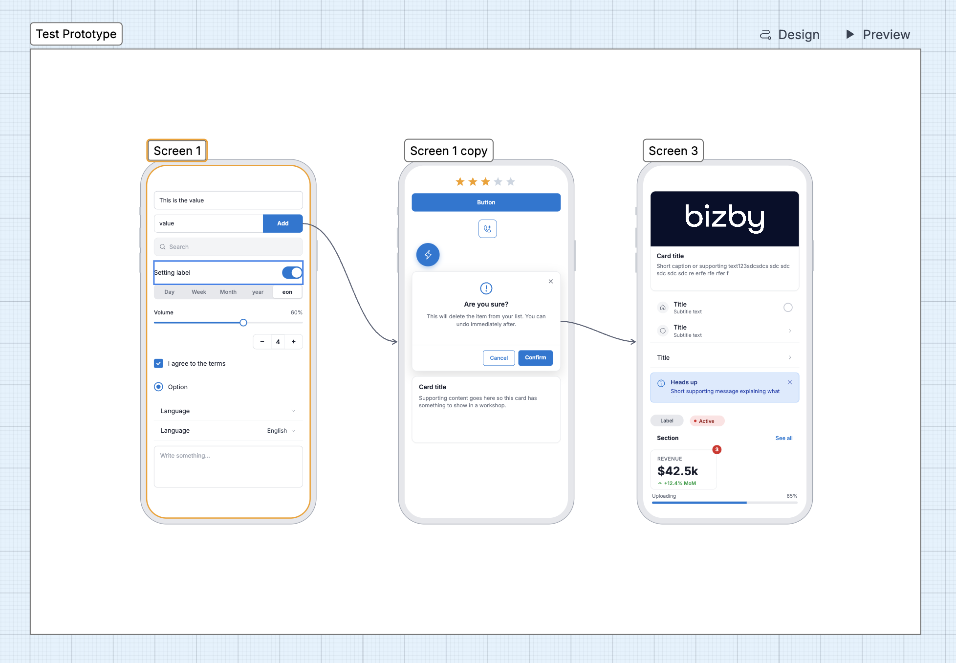
Button layout at a glance
Section titled “Button layout at a glance”Where every prototype control lives, by location:
Canvas toolbar
- Prototype tool — arms the cursor; your next click drops an empty Prototype frame. Pin it to the toolbar (or find it in the tool picker) for quick access.
Prototype frame heading (on the board, top-right of the frame)
- Design — enter Design mode for that prototype.
- Preview (▶) — play the prototype. Disabled until the prototype has at least one screen (“Add a screen to preview”).
Context toolbar (appears when the Prototype frame is selected)
- Settings (gear) — open the Prototype settings dialog.
- Lock — lock the frame in place.
- More (⋮) — standard shape actions.
Design mode — header
- Back to board (Bizby logo / link, top-left) — exit Design mode.
- Preview (▶) and Settings (gear), top-right.
- Presence — collaborators on the board.
Design mode — side panel (right)
- Tabs: Components | Properties.
- Components tab — an Add Screen row (device buttons), a search field, and the draggable component grid.
- Properties tab — edits the selected component or arrow (auto-selected when you pick a single item).
Preview player — bottom pill
- Back (←) — previous screen in history.
- Highlight hotspots — press and hold to show every tappable region in blue.
- Screen X / Y — position counter.
- Exit (red, or
Esc) — close the player and return to the board.
Creating a Prototype
Section titled “Creating a Prototype”- In the canvas toolbar, choose the Prototype tool (pin it, or open the tool picker), then click the canvas to drop an empty Prototype frame.
- Click Design on the prototype’s heading to enter Design mode.
- In the side panel’s Components → Add Screen row, pick a device — Mobile, Tablet, or Desktop. The first screen lands centred; subsequent screens cascade horizontally.
Beta 1 note: only Mobile is enabled in the Add Screen row. Tablet and Desktop presets are wired but disabled — they switch on in a follow-up beta once their default chromes ship.
Design Mode
Section titled “Design Mode”Design mode hides the rest of the board so you can focus on the prototype as if it were the whole canvas. While focused, the prototype’s own frame border is hidden for you — collaborators still see it at its real size.
- Add components — drag any item from the Components tab onto a screen; it snaps into the screen’s vertical stack.
- Edit a component — select it and the panel switches to Properties, where you set its label, value, style/variant, and accent color (see Theming).
- Add more screens — use the Add Screen row any time; new screens inherit the prototype’s default device.
- Exit — click Back to board. On exit the prototype frame auto-shrinks to fit its screens plus padding, so it never leaves a giant empty rectangle on the board.
Components
Section titled “Components”The UI-kit covers common app building blocks, including: buttons (button, icon button, FAB), inputs (text input, search, textarea, checkbox, radio, select row, toggle, slider, stepper, segmented control), navigation (nav bar, tab bar, action sheet, bottom sheet), content (card, image card, list item, avatar, chip, status pill, badge, stat tile, progress bar, rating, section header, banner, empty state), and feedback (modal, snackbar, notification, status bar). Use the search field to filter the grid.
Linking Screens
Section titled “Linking Screens”Hover any component to expose a binding port (a small circle on its edge). Drag from that port onto another screen — the target screen highlights and the arrow snaps to its centre. Release to create a binding arrow.
Binding arrows always enter the target on the side closest to the source, anchored at the middle of that side — no per-pixel positioning. Components with multiple targets (an action sheet’s rows, a modal’s buttons) can each point to a different screen.
Transitions
Section titled “Transitions”Select an arrow and set its transition from the Properties panel / context toolbar:
- Instant — the next screen replaces the current one immediately
- Fade — cross-fade between screens
- Slide L / Slide R — the incoming screen slides in from the left or right
Each arrow can also set a Duration (ms), or Reset to inherit the prototype’s default transition (see Settings below).
Prototype Settings
Section titled “Prototype Settings”Open the Settings (gear) from the context toolbar or the Design-mode header. The dialog has:
- Title — the prototype name and an optional description.
- Flow → Start Screen — which screen the Preview opens on.
- Theme → Accent color — the prototype’s brand color (see below), with Reset to default.
- Default device — the device new screens use (Mobile in Beta 1).
- Default transition — the Style (Instant, Dissolve, Slide left, Slide right, Overlay) and Duration (ms) that arrows use unless they override it.
Screen settings: select a screen and open its gear to set the screen’s Title, device preset, and Set as Start.
Theming
Section titled “Theming”Set an Accent color in Prototype Settings → Theme. It cascades to every component’s accent — button fills, active tabs, toggles, links, progress fills, and highlights — across all screens.
To override a single component, select it and use the Accent color swatch in its Properties (with a Use theme / Reset option to revert). Both pickers offer the standard preset palette plus your saved custom colors.
Preview
Section titled “Preview”Click Preview on the prototype heading (or in the Design-mode header) to enter the player.
- The active screen renders centred with the chosen device chrome.
- Tap any component that has an outgoing arrow to trigger its transition.
- The bottom pill holds Back, Highlight hotspots (press and hold), the Screen X / Y counter, and Exit (red /
Esc).
Preview is read-only — settings and content changes happen back in Design mode.
- Collaboration: Design mode is local to you. Collaborators still see the prototype frame at its real size and can edit screens normally — they just don’t see your focused workspace.
- Reload safety: if you reload mid-Design-mode session, the next load detects any “stranded” expanded prototype and collapses it back to fit its screens.
- Same-prototype only: arrows can only target screens that share the source’s prototype. Cross-prototype flows are intentionally blocked — each prototype is its own self-contained flow.
Known Beta 1 Limitations
Section titled “Known Beta 1 Limitations”- Add Screen: Tablet and Desktop presets are disabled.
- Tap-to-edit is intentionally removed from some interactive components (segmented control, action sheet) so the canvas selects on first click — set those values from the Properties panel.
- Some component icons are still being refined.
We’ll roll these forward in subsequent beta releases. File feedback from the in-app Feedback button and tag it prototyping.