 Features / Board Tools
Content Widgets
Build a piece of content once and reuse it everywhere. A Content Widget is a published frame, document, or planner that lives in your team’s Widget library, ready to drop onto any board. When you change the source and publish again, every board that uses the widget updates to match, so there is one source of truth instead of copies that drift apart.
The Content Widget Canvas
Section titled “The Content Widget Canvas”Content Widgets are authored on a dedicated board called the Content Widget Canvas. It works like a normal board with one difference: everything on it is meant to become a reusable widget. A centered pill at the top marks the canvas, shows a live count of how many widgets it holds (published versus draft), and carries an info button that summarizes the workflow.
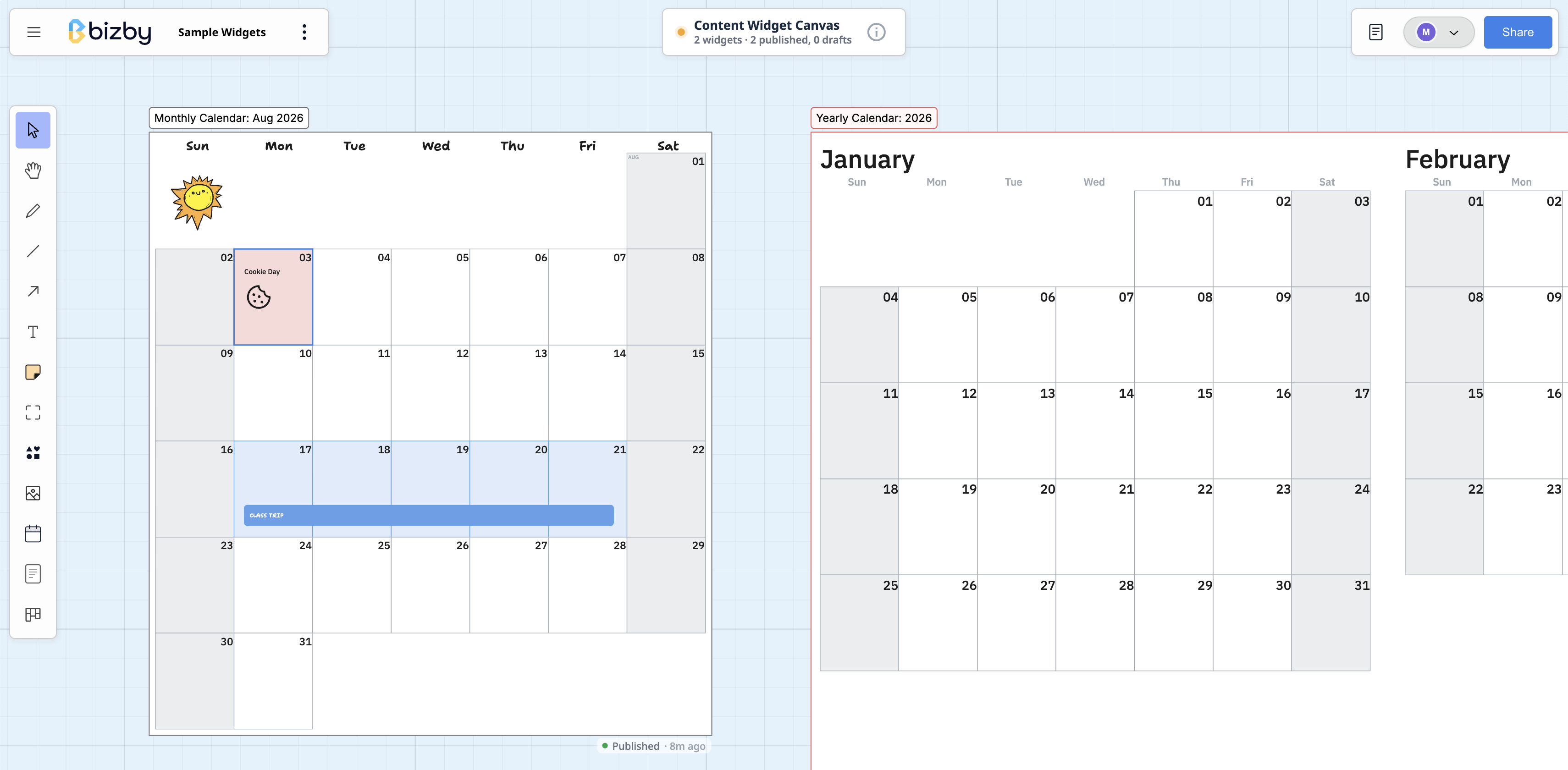
The canvas offers a focused toolbar and a limited set of content types on purpose. Keeping widgets to frames, documents, and planners is what lets them stay portable and render the same way on any board, at any size.
Design a widget
Section titled “Design a widget”On the Content Widget Canvas, build each widget as one of:
- A frame, for anything you can lay out on the canvas: a legend, a diagram, or a slide.
- A document, for rich text like a policy, a brief, or a set of instructions.
- A planner, for a reusable board layout with columns and cards.
Design it exactly as you want it to appear when a teammate places it.
Publish to the Widget library
Section titled “Publish to the Widget library”Select a widget and click Publish on its toolbar. Give it a name and confirm. The widget is exported and added to your team’s Widget library, where anyone on the team can find it. A marker under the widget switches from Draft to Published so you can see at a glance what has been shared.
Publishing captures the widget’s designed size, so embeds keep the proportions you intended.
Use a widget on any board
Section titled “Use a widget on any board”On any other board, open the Content Widgets panel from the Board tools menu. It has two tabs:
- Widget library lists every published widget you can use. Search by name, then click Insert to place one. Widgets already on the current board show an “already on this board” chip instead, so you do not add duplicates by accident.
- In use lists the widgets already placed on this board. Click one to jump to it on the canvas.
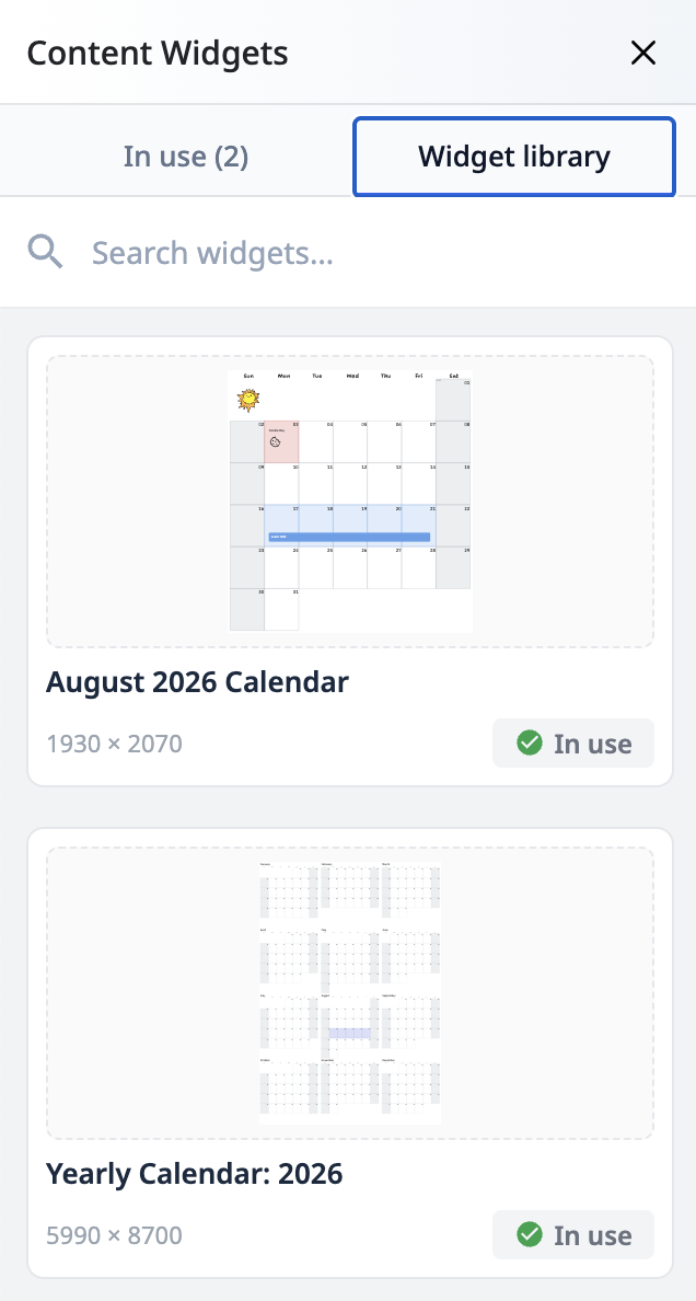
After you click Insert, your cursor is armed to place the widget: click where you want its top-left corner and it drops in at its designed size. Embeds are read-only, so no one can edit a placed widget by mistake.
Update everywhere at once
Section titled “Update everywhere at once”To change a published widget, edit its source on the Content Widget Canvas and click Update on its toolbar. Every board that uses the widget refreshes automatically to show the new version. Each embed also shows when the widget was last published, so it is clear how current it is.
Published and draft markers
Section titled “Published and draft markers”Every widget on the Content Widget Canvas carries a small marker beneath it:
- Draft means the widget has not been published yet, or has never been shared.
- Published means it is live in the Widget library, with the date it was last published when there is room to show it.
This makes it easy to scan a busy canvas and tell finished widgets from works in progress.
Who can publish and change a widget
Section titled “Who can publish and change a widget”A widget is team content, so it carries ownership rather than being a free-for-all:
- Anyone on the team can create a widget.
- The person who made it, or a team owner or enterprise admin, can edit or delete it. Nobody else can change a widget out from under the boards using it.
- Anyone who can open a board can see an embedded widget, including a guest who is not on the team. That is deliberate: an embed has to render for whoever the board was shared with.
These rules are enforced on the server, not only in the interface, so they hold for anything reaching the data directly.
Keeping a house style
Section titled “Keeping a house style”Between them, three things let a team keep a consistent look without policing it by hand:
- Content Widgets for content that should be identical everywhere it appears: a standard header, a set of ground rules, a service description, a legal footer. Authored once, embedded read-only, edited in one place.
- Team templates for whole board layouts a team starts from. Publishing to the team library is limited to owners and admins, so the shared set stays curated. See Templates.
- Prototype theming for design work. A prototype frame carries a theme colour that every UI component inside it picks up, with a per-component override where something needs to differ, so a prototype can be put in an organisation’s own colour in one change rather than component by component. See Prototyping.
The intent is that a team’s own material lives in one place, with a known owner, rather than being copied between boards and drifting.