 Features / Shapes & Drawing
Rounded Rectangle Corners
Overview
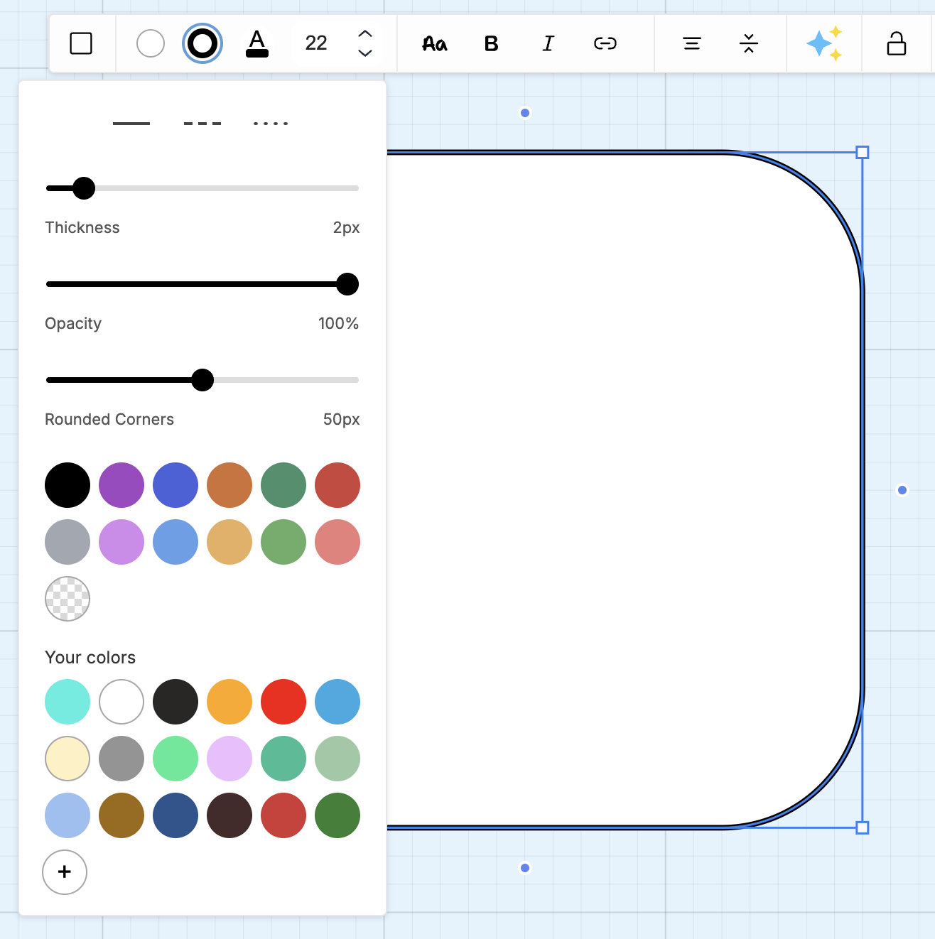
Section titled “Overview”Rectangle shapes in Bizby now support customizable corner radius. You can adjust corners from sharp (0px) to fully rounded (100px), giving you more control over the visual style of your shapes.
Key Features
Section titled “Key Features”- Adjustable Radius - Set corner roundness from 0 to 100 pixels
- Visual Slider - Easy-to-use slider control for quick adjustments
- Precise Input - Enter exact values for consistent shapes
- Per-Shape Setting - Each rectangle can have its own corner radius
How to Use
Section titled “How to Use”- Select a rectangle shape on your board
- Click the border settings icon (ring icon) in the context toolbar
- Find the corner radius slider
- Drag the slider or enter a value (0-100px)
- The corners update in real-time
Corner Radius Values
Section titled “Corner Radius Values”| Value | Result |
|---|---|
| 0px | Sharp, square corners |
| 4-8px | Subtle rounding, professional look |
| 12-20px | Moderate rounding, friendly feel |
| 30-50px | Significant rounding, soft appearance |
| 100px | Maximum rounding (pill shape on narrow rectangles) |
Use Cases
Section titled “Use Cases”UI Mockups
Section titled “UI Mockups”Match the corner radius of buttons and cards in your design system.
Containers and Groups
Section titled “Containers and Groups”Create visually distinct containers for grouping related content.
Visual Hierarchy
Section titled “Visual Hierarchy”Use different corner radii to distinguish between element types (e.g., sharp corners for data, rounded for actions).
Aesthetic Consistency
Section titled “Aesthetic Consistency”Match the visual style of your brand or existing materials.
Related Features
Section titled “Related Features”- Right-Angle Triangle - New triangle shape
- Custom Colors - Color customization for shapes
- Arrow Handles - Connect shapes with arrows
- Feature Overview - See all Bizby features