 Features / Collaboration
Card Component
Overview
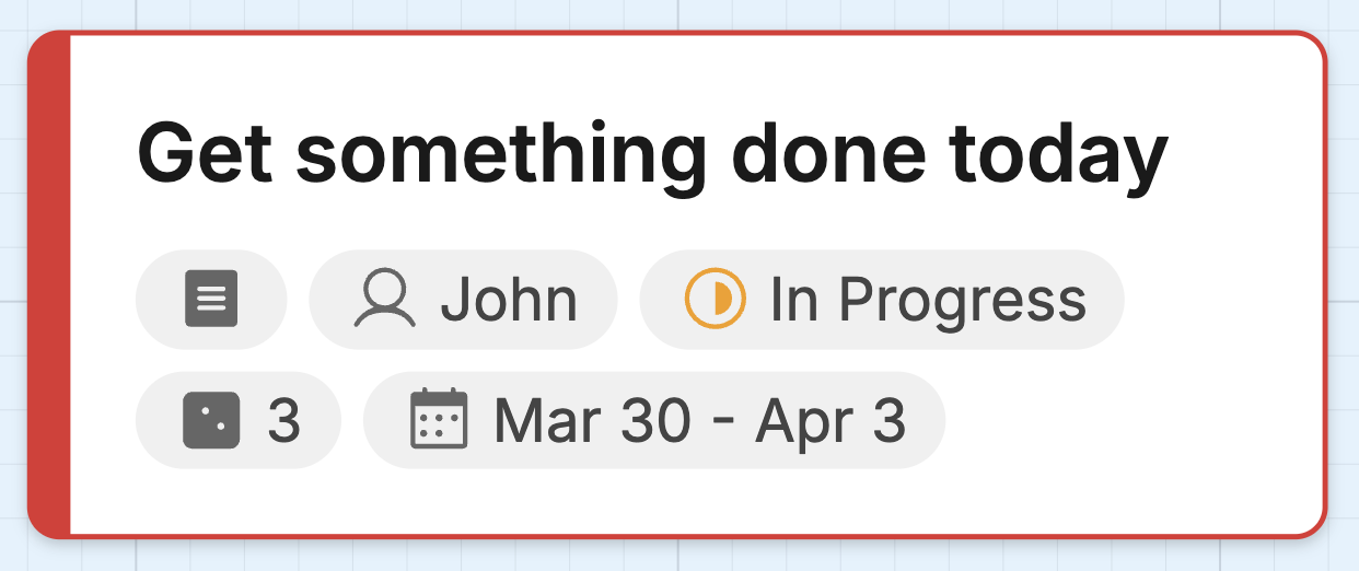
Section titled “Overview”The Card component lets you create structured information cards directly on your Bizby canvas. Each card supports a title, rich text description, status, assignee, estimate, and date range. Cards can be dragged into grid cells for kanban boards and structured layouts.
Key Features
Section titled “Key Features”- Inline Title Editing - Double-click to edit the card title directly on the canvas
- Status Tracking - Track progress with To Do, In Progress, and Done states with visual icons
- Rich Text Description - Add formatted descriptions with headings, lists, task checkboxes, links, and text color via the edit dialog
- Metadata Fields - Assignee, estimate, start date, and end date shown as compact chips
- Accent Color - Customizable left border color via the context toolbar
- Grid Compatible - Drag cards into grid cells for structured layouts
How to Use
Section titled “How to Use”- Click the Card button in the shapes menu (left column, top)
- Click anywhere on the canvas to place the card
- Double-click the card to edit the title inline
- Click the pencil icon to open the full edit dialog for description, status, and other fields
Status Icons
Section titled “Status Icons”| Status | Icon | Description |
|---|---|---|
| To Do | Empty circle | Work not yet started |
| In Progress | Half-filled circle | Work is underway |
| Done | Green check circle | Work is complete |
Edit Dialog
Section titled “Edit Dialog”Click the pencil icon (top-right corner on hover) to open the edit dialog with:
- Title - Card name
- Description - Rich text editor with formatting toolbar
- Status - Dropdown with None, To Do, In Progress, Done
- Assignee - Person responsible
- Estimate - Story points or time estimate
- Start / End Date - Date range with calendar picker
- Use tool lock to place multiple cards in succession
- Cards support border color changes via the context toolbar
- Drag cards into grid cells to build kanban boards or comparison tables
- Cards auto-size their height based on content
Related Features
Section titled “Related Features”- Grid Component - Structured tables and grids for organizing cards
- Sticky Note Stacks - Quick note creation for brainstorming
- Interactive Poll Component - Polls for team voting